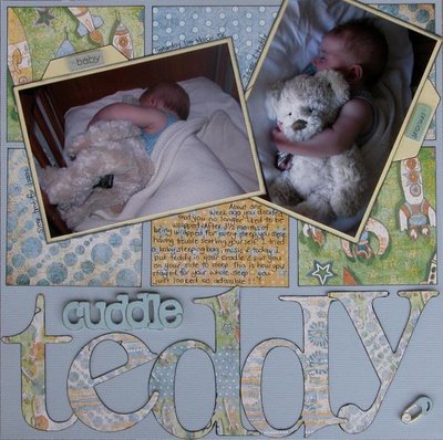
I got SM 8.5 this morning and just sat down to check out a LO I had in it...GGRRRR what is it with the photography in this mag??????? My cuddles for Teddy LO is SO washed out the cardstock looks white.....it is actually blue as you can see

.
I was excited to see Isaac right by his little friend Jamie though! Well thats my whinge for the day!
Have a good day everyone!
 .
.
7 comments:
oh,,that's so annoying hey. I remember that happening heaps to me. (haven't submitted for about 18 months)...oh well, at least you were in there hey.
Gayle
ooh, that sux huh. I don't have SM yet, but I totally know how you feel! Most of mine look awful!!
Well, it's a gorgeous LO here!!
Wow that is such a difference isn't it? I totally relate because my Roxy gals LO on page 28 is really really washed out too, I think it is the worst I've ever seen!
Is Jamie in there? LOL, I have totally lost track coz it's sooo long since I saw SM. Are they on the same page? How cute!
I love that page, and I'm peeved for you about the photography. It seems to happen quite regularly, hey!
I had such fun on Monday! It was great that we even managed to get our scrapping stuff out. Your LO looks great. Can't believe how quick it came together!
Yay for getting out to Creative Edge. wooohooo. Bring on January :)
Kathie
Hi Nic,
What a bugger that it looks washed out in the mag! Here though, the colours look just gorgeous.
Megan xx
Beautiful stunning baby layout chicky! I love the sweet pastel PP!
Anyway! Besides all the washed LO's! SM printed one of my layouts on its side! I think the journalling the wrong way around might be a hint! Hello!!!! Lol! Pathetic hey!
This is such a gorgeous layout Nic. It's such a shame that the mags can't get it right. They really need to take a good look at whats been happening and what is being said around the place. It's not just the disappointment of the artist, but also the consumers paying good money to see quality images of layouts. Not good enough hey!!!
Post a Comment